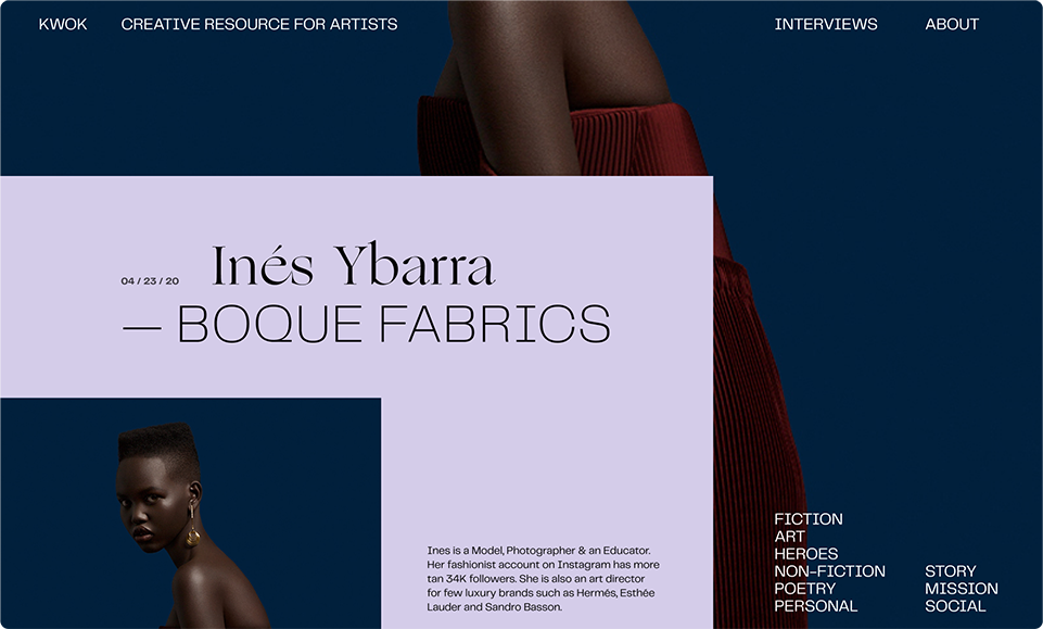
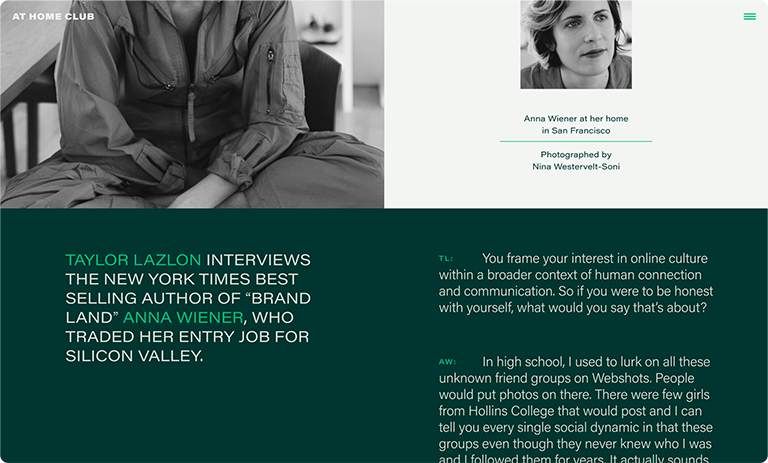
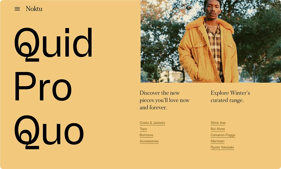
At Squarespace I designed layout systems and built features that aimed at helping our user’s self expression.

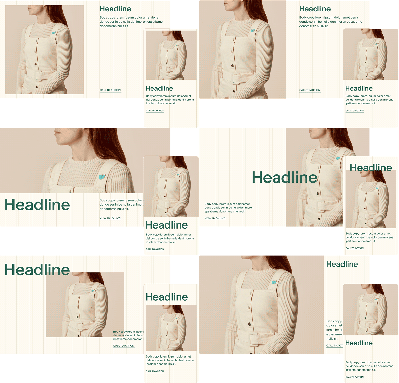
As Staff Designer on the Character team at SQSP, my role was to define what’s possible on the web and deliver experiences that are unique to SQSP. For the most part it involved defining layout types based on user needs and exploring the relationship between elements on that given layout.

layout-story.gif

Expressibility can be defined as the richness of that defined design system, which involved creating a foundation that could scale into multitudes of different layout options, enabling our users to express themselves beyond simple intentions.

[E.G. A SIMPLE LIST]

list-simple.png

[ITS VARIANTS]

list-1png
list-2.png
list-3.png

The goal of these layout systems was to accurately represent the breadth of each layout type. It was an exercise of putting together all aspects of a layout in a cohesive way where elements could be combined and rearranged to create different ready-to-use layout configurations for template starting points.

[E.G. SECTION STORE]

section-store.png

All these styling options that allowed these layouts to come to life (font pairings, color palettes, etc.) were then tested and packaged to live inside the product as design features. My job was about curating these offerings and help identify the right controls to surface in the editor.

font-pairings.png
color-roles.gif
styling-options.png

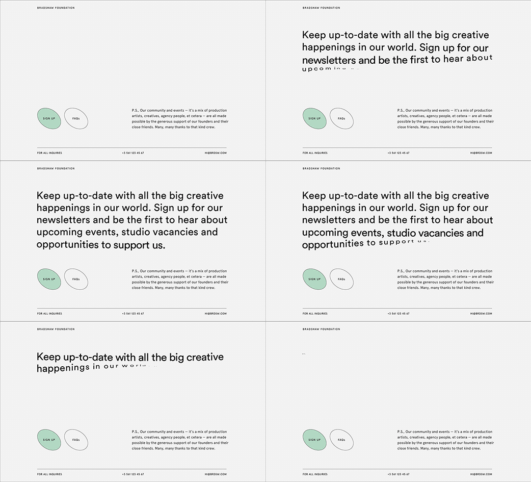
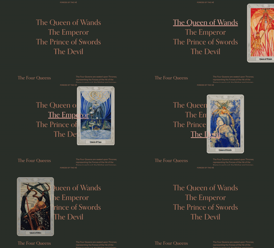
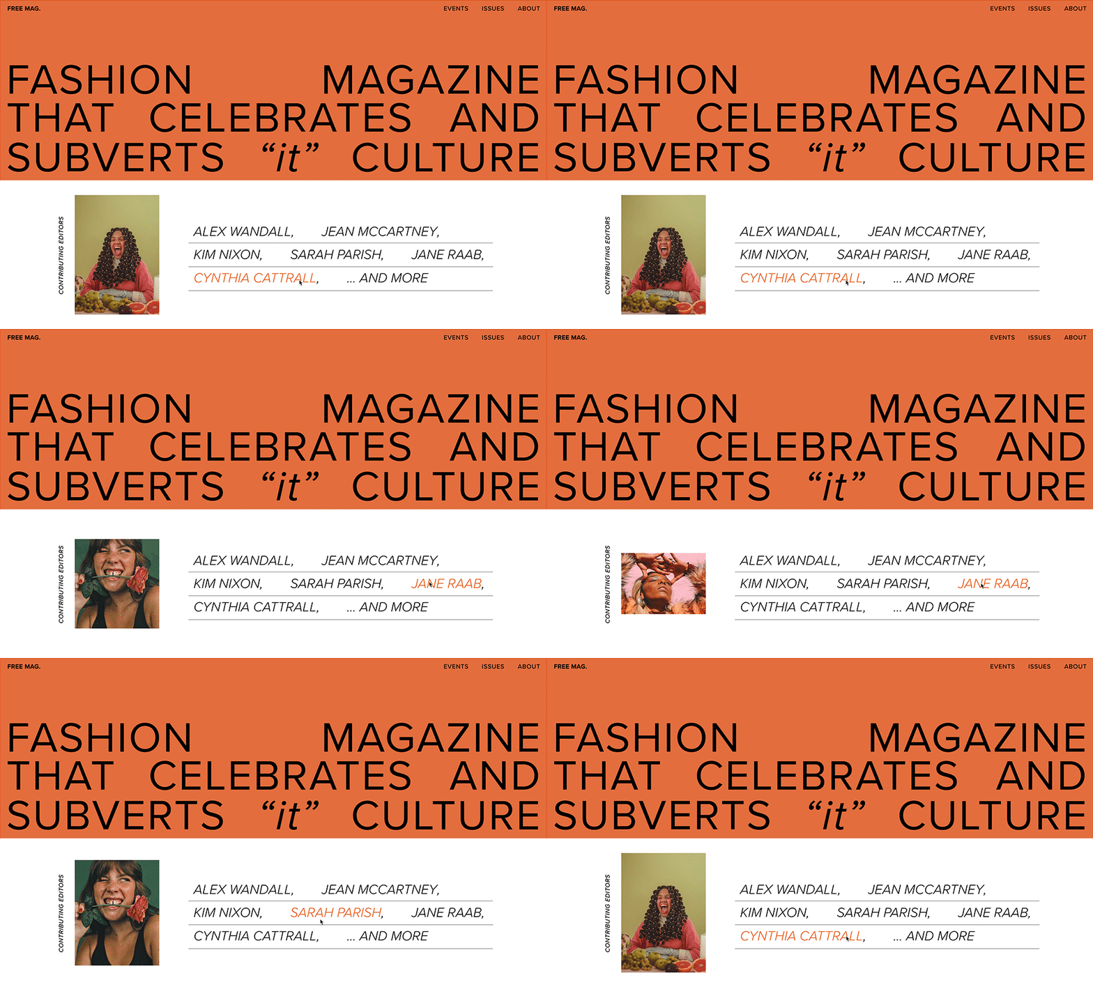
By nature, these initial starting points covered common use cases, but by focusing on what types of information different user groups needed, we came up with a wide range of expressibility features that allowed for even more creative expression in the way they went around to display information.

[E.G. EXPRESSIBILITY IN TEXT-DRIVEN LAYOUTS]

text-1.png
text-2.gif
text-3.png

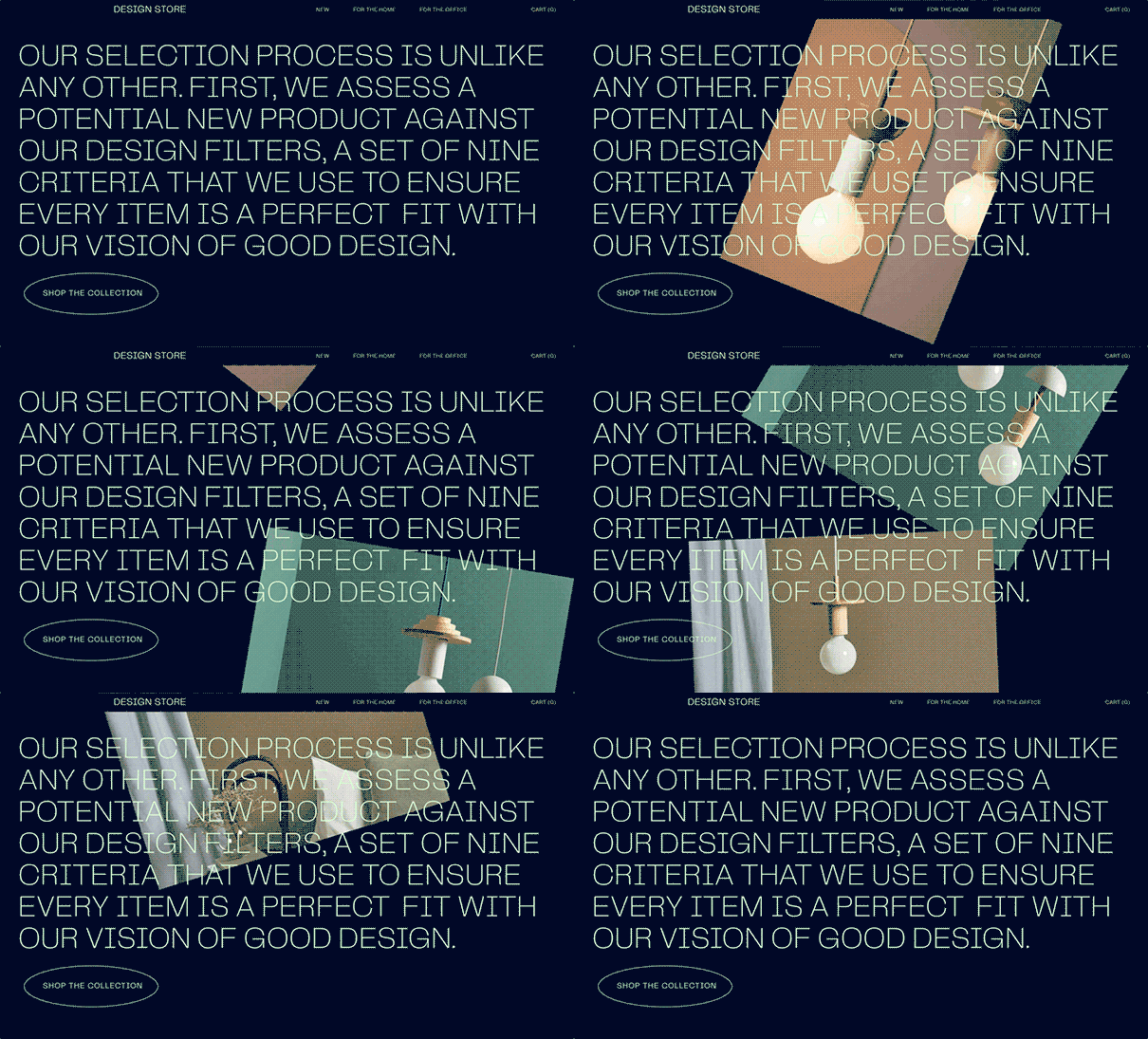
These expressibility features came from actively researching the web and investigating new technologies. Once the features were applied to specific layout types, they were explored further to address additional user needs and desires.

[E.G. TEXT-DRIVEN LAYOUTS + MEDIA]

text&img-1.gif
text&img-2gif
text&img-3

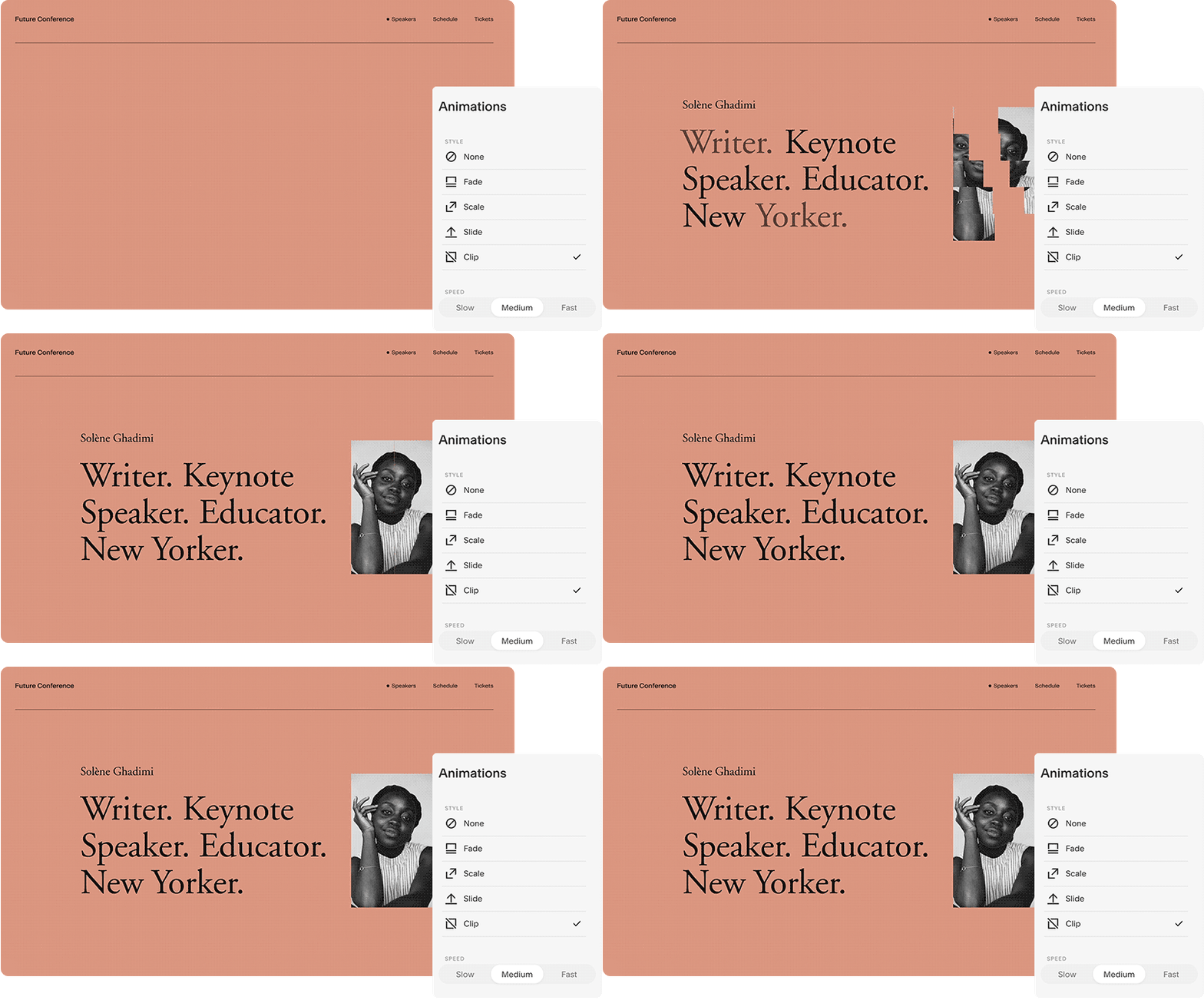
These explorations helped steer the product in two ways. ONE they informed which existing layout structures to improve, which provided insights into what to solve for from a design POV. TWO they led to new conceptual product initiatives.

[SUCH AS ANIMATIONS]

animation.gif

All this work came down to accounting for the many ways a user might want to display and organize their content, and it was much more than being a good web designer. It involved setting clear rules and legislating millions of edge cases — all while making sure the underlying system continued to work with the variations that were added or removed.